

Bluespace Behavioral
Freelance Web Design
I designed and developed a website for transportation workers seeking DOT-SAP (Department of Transportation Substance Professionals) counseling providers, as well as information on the return-to-duty process and reasons for DOT-SAPs
My Contributions
Project Overview
-
UX/UI Designer
-
Web Developer
-
Performed Market Research
DOT workers failing drug and alcohol screenings are suspended from work and need to see certified counselors for reinstatement. I was tasked with creating a website for workers to locate providers and for counselors to become affiliates.
Design Process
DOT workers failing drug and alcohol screenings are suspended from work and need to see certified counselors for reinstatement. I was tasked with creating a website for workers to locate providers and for counselors to become affiliates.
I applied UX design techniques to create a user-friendly website primarily for DOT workers.
I received a document with disorganized information for the website. I conducted a card sort by summarizing sections on post-it notes to arrange the content logically, prioritizing important information at the top and less frequently accessed information lower down the page.

Card Sort
While conducting the card sort, I sketched wireframes to visualize the content's order and layout, including horizontal section dividers. This wireframe served as a reference during the site's coding process.

Website Wireframes
The company name "Bluespace Behavioral" was inspired by DOT clients looking at "blue space" while working. I designed the masthead to depict the blue space seen by workers in the 4 DOT sectors.

User Centered Imagery
I ensured the top navigation bar remained sticky on the continuous page layout for easy and quick section changes, eliminating the need to scroll back to the top.
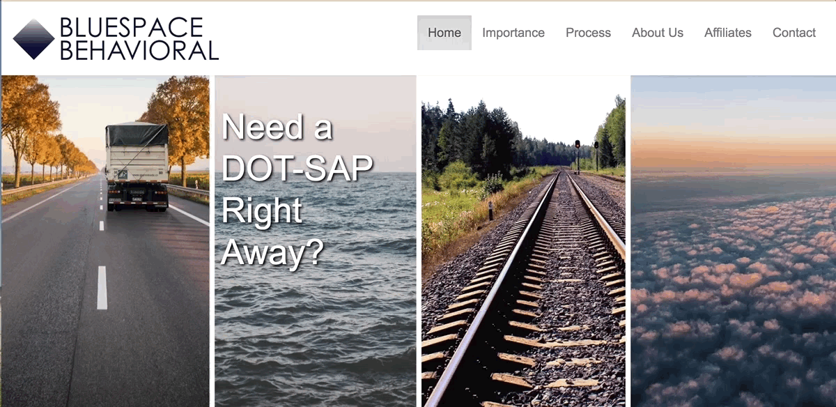
Sticky Nav
I used Twitter Bootstrap to code the site, ensuring responsiveness and usability on all devices.
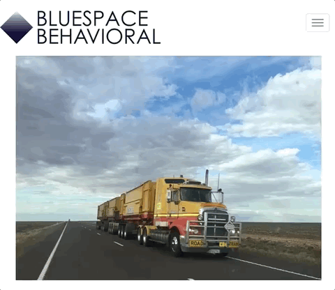
I designed two masthead images — one for larger viewports and another for mobile devices — recognizing the need for adaptability across different screen sizes.

Mobile Header
I ensured images on the site resize smoothly with changes in viewport size, maintaining layout consistency and preventing distractions from irregular photo proportions or sudden size shifts.
Fluid Resize
I added an <a> link to the client's contact phone number, enabling users to click and call directly from their phone or computer with messaging capabilities.

Phone Link
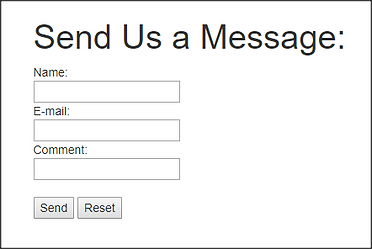
I added a user-friendly contact box for easy email communication directly from the site.
Outcomes
Contact Box
I presented an early version of the site to my client for feedback, resulting in minor wording changes and the removal of a blue tint on the mastheads. Overall, she was pleased with the site!
Reflecting on the project, I would have preferred involving more people in the card sort for diverse opinions, especially from potential users. Additionally, greater client involvement throughout the design process would have been prudent to avoid potential time wastage on an unaccepted design.