Barn Buddy
Horse Barn Management Personal Project
Inspired by my own involvement in the equestrian world and recognizing the need for an all-inclusive solution, I’ve been developing a barn management app. This app is designed to simplify the complex needs of barn owners, managers, and clients by allowing them to schedule and request lessons, set and share goals, manage horse profiles, and enter and track horse shows.

My Contributions
Project Overview
-
Product Designer
-
UX/UI Designer
-
Designed app from conception to high fidelity prototype
-
Executed user research techniques throughout process
-
Prototyped app with different levels of fidelity
I have been developing a barn management app designed to streamline the various tasks involved in managing a horse barn. This app enables barn owners and managers to schedule lessons, take notes on horses, view client goals, and track both hosted and attended shows. On the client side, users can request lesson changes, manage their horse profiles, set goals to share with their trainers, and create and track horse show entries and results.
Throughout this project, I’ve deepened my knowledge of Figma, exploring its advanced prototyping capabilities to create both mid and high-fidelity versions of the app.
The inspiration for this app comes from my own experiences in the equestrian world, where I noticed a lack of comprehensive solutions. My hope is that one day this app can come to fruition and help modernize barn management, bringing the "stuck in the past" horse world into the future, resulting in happier barn management and clients.
Design Process
My journey with this barn management app began by reflecting on my own experiences in the equestrian world. I started by examining the scheduling app used by the barn where I ride, Fresha, along with several other barn management apps. My competitive analysis helped me identify what these apps did well and, more importantly, what they lacked.

Competitive Analysis
After this analysis, I decided my app needed to emphasize goal setting and competition integration—two areas largely neglected by existing apps. I also wanted to make lesson scheduling more robust, as the current market offerings were too basic. While horse profiles were common features, I took it a step further by adding rider profiles. This addition not only made the goal-setting feature more relevant by allowing for both horse and rider goals but also enabled the integrated messaging and client side scheduling features.
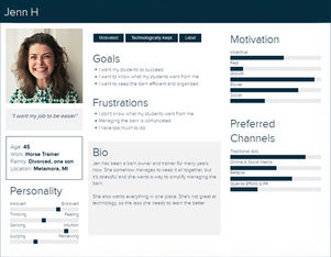
To ensure the app would meet the needs of both clients and trainers, I developed two key personas: one representing a typical client and the other a trainer. These personas helped me better understand the different motivations, pain points, and needs of each user type, ensuring that the app would be intuitive and beneficial for both parties.

User Personas - Jenn (Trainer) & Mara (Client)
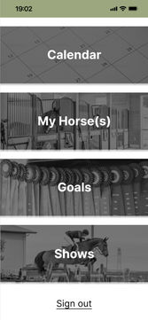
Once I had a clear vision, I began building the app in Figma, starting with a simple login flow that led to the main menu. Over time, the main page evolved visually; I swapped out the basic buttons for images that better represented the app's features. This change not only made the interface more descriptive but also improved usability by increasing the button sizes, making them easier to interact with.

Home Screen Improvement
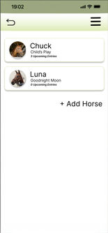
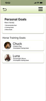
With the login and account creation processes finalized for both clients and trainers, I moved on to building out each feature, starting with the "My Horse(s)" section. Here, users could create detailed profiles for their horses, which would link to both their goals and show entries. After completing the horse profiles, I developed the goals section, which included rider profiles to allow tracking and sharing of goals with trainers. The shows section followed, enabling riders to manage their show entries and view upcoming, current, and past shows. Finally, I built out the calendar feature, where clients could request or cancel lessons, and trainers could manage these requests seamlessly. Throughout the design, I prioritized communication, ensuring that neither clients nor trainers would miss any updates or changes.

*Screens Are From Client Side of App
After completing the first iteration of the app, I developed detailed use cases and crafted storyboards to visualize how different user types would interact with the app. For example, I created a storyboard for the trainer account creation process, highlighting the steps a trainer would go through when setting up their profile, linking horses and riders, and configuring their schedule. This process was critical, as trainers have a unique set of needs compared to clients, and I needed to ensure that the app would intuitively support their workflow.
Trainer Account Creation:

Similarly, I developed a storyboard for the client account creation process, which mapped out how a client would manage their horses, set personal goals, and interact with their trainers through the app. I focused on making this process as straightforward as possible. The goal was to create a seamless onboarding experience that would encourage continued use of the app.
Client Account Creation:

You Can View All of My Use Cases and Storyboards on My Figma File
These storyboards were instrumental in identifying gaps in my initial design. For instance, while building out the app, I realized that I had overlooked certain edge cases, such as what happens when a trainer manages multiple barns or when a client has more than one trainer. The storyboarding process helped me catch these gaps early on and make the necessary adjustments. It also allowed me to visualize the flow of information between different sections of the app, ensuring a cohesive and user-friendly experience.
During the testing phase, I encountered a few bugs and usability issues. While I fixed the bugs before conducting subsequent tests, I left the usability issues to confirm whether users consistently faced the same problems.
One key decision was to remove the progress bar from the new goal creation popup. I had originally included the progress bar because I anticipated that users might add goals that were already in progress. However, during testing, users found the progress bar confusing when they were creating new goals, as there was no progress to display yet. Realizing that the scenario of adding an already-in-progress goal was more of an edge case, I opted to remove the progress bar from the creation process. Users could still update their progress in the goal edit popup after the goal was created.
Additionally, I made several other adjustments to improve usability. For example, I added a blinking cursor in text input fields to clearly indicate where users could type, and I ensured that the calendar scrolled correctly by month. To enhance visibility in the calendar section, I added shadowing and bolded text to make message notifications stand out.
Confident in the improvements I made, I shared the updated prototype on LinkedIn to gather feedback from my network. The feedback, especially from my former boss Nick Davio, was crucial in guiding my next steps. Nick’s input prompted me to refine the design, making it more polished and user-friendly.
I introduced a bottom navigation bar to improve usability, replacing the original hamburger menu, which required more clicks. This change made the app easier to navigate and aligned with current UX trends. Additionally, I upgraded the design to higher fidelity screens, giving the app a more professional look, which was important for potential future development. I also adjusted the color palette to be softer and less overwhelming
During development, I had to learn how to use Figma’s advanced prototyping capabilities, particularly its conditional logic. This was a new challenge for me, but my previous experience with Axure and some backend coding knowledge helped me get up to speed quickly. Autolayout was another hurdle, but I’ve since become proficient in it and now regularly create responsive prototypes in my current role at GM. Expanding on my Figma knowledge allowed me to streamline the prototype, reducing the number of screens while enhancing interaction flow. Learning to use Figma components also ensured consistency across the design, bringing me closer to realizing my final vision for the app.
While there is still work to be done, these iterations have brought me closer to a final vision for Barn Buddy, and I'm proud of the progress I've made.
Project Vision
Looking ahead, Barn Buddy aims to become a comprehensive solution for horse barn management, enhancing the experience for both barn managers and clients. The vision for Barn Buddy includes several key advancements:
-
Advanced Horse Profiles: I plan to expand the horse profiles to include detailed breeding information, medical records, and farrier reminders. This will offer a more holistic view of each horse's health and history, enabling better care and management.
-
Integrated Payment System: A future update will introduce an integrated payment system, allowing users to handle payments for lessons, training sessions, and other services directly through the app. This will streamline financial transactions and improve convenience for users.
-
Horse Show Integration: I aim to connect horse show entries with the lesson calendar, providing visibility into when clients and trainers will be participating in shows. This feature will enhance planning and coordination, ensuring that schedules are well-managed and potential conflicts are minimized.
These planned enhancements are designed to address existing gaps in the market and build on the foundation laid by the initial version of Barn Buddy. By incorporating these features, I hope to create a more robust and valuable tool for the equestrian community.
Outcomes
While Barn Buddy is still an evolving project, I’m proud of its current state and excited to share this iteration. It’s clear that there’s more work ahead before it’s ready for public release. I plan to refine the horse profiles to include breeding information, medical records, and farrier reminders, enhancing the depth of each profile based on competitive analysis.
Future updates will also aim to add an integrated payment system for lessons and services and improve horse show integration. I want to link horse show entries with the lesson calendar to better manage scheduling and client availability.
I am committed to ongoing improvements and will continue user testing to ensure that each enhancement adds value. Your feedback is welcome as I work towards making Barn Buddy a comprehensive tool for barn management.
Explore the current prototype and design files here:


